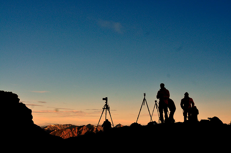
I’m in the process of getting ready for my heli-hiking photography trip in September, and was experimenting a bit with Instagram (you can follow me here and watch my real-time postings of images made high in the Rockies in breathtaking vistas only accessible by helicopter – staring September 6, 2013! click here)
INSTAGRAM-ISH
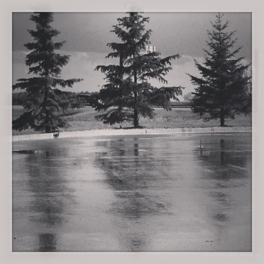
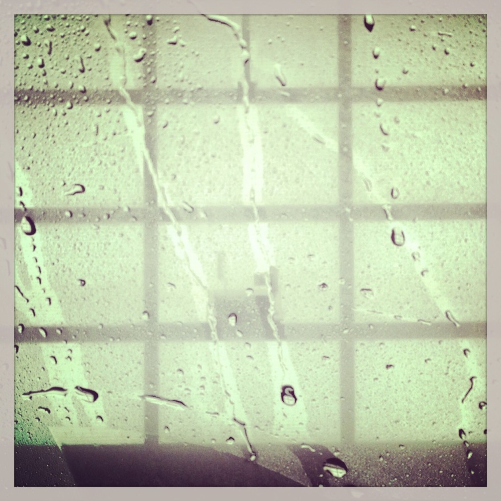
In Instagram, all your images are square – even images you upload into Instagram have to be cropped to be square. I’m ok with this but it occurred to me that square is mostly are new format for lots of us, more use to thinking about the 2/3 format of most cameras.
So Instagram, other iphone and mobile camera apps do use this square format. We’re seeing a lot more square images in all sorts of places. But please note this is not a “trend” – square format images have been around forever and many of the first cameras used square film. So it’s really a “back to the future” kind of format.
So how can you best crop into a square either in your mobile app or in lightroom or Photoshop?
The main reason I want to crop better for square formats is that you can really enhance your composition and “force the subject” I’m not sure that this is a real term but it’s how I feel when I crop square – I’m forcing the viewer to see the subject very clearly! And sometimes that square format is just necessary like in apps like Instagram – if you import your photos you have to crop them square.
But there are just so many new ways to compose in a square format, don’t let the square stuff bring you down. The rule of thirds can apply in a square format, and you can take advantage of the hidden circle in every square – which, if you composition is strong, keeps the viewer IN the image. The eye follows that implicit circle around and around .
You can get really dramatic leading lines which direct the viewer right where you want them to go in a more creative way. And with some creative cropping you can easily add drama where there was none before.
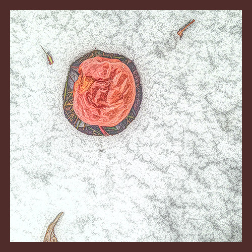
Sit in the corner. Not only does the square format remove the usual dilemma of landscape or portrait aspect, – a square is a square, no matter which way you turn it – you can so some really creative things that wouldn’t work at all in landscape or portrait formats on most cameras. Like keeping your subject in the corner. It’s a cool way to add instant interest, and to create some tension as the viewer will try to fill in the rest of the image – the part outside the frame!
Put your subject in the center or just off centre. While bull’s eye composition – placing your subject bang in the centre of the frame – is usually a deal breaker for many images, in a square format it can be quite powerful and dynamic. Flowers, faces and a multitude of other subjects work well in a centred composition. But also try other variations – Instagram for example gives you some freedom about HOW you crop your imported photos, so play around.
Fill the frame. The Square is such a powerful shape; when you fill the frame, the photo becomes so much imposing and our brains becomes so much more enchanted by it.
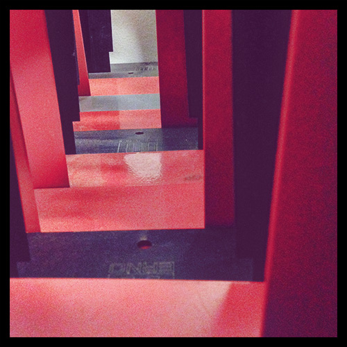
Incorporate lines and curves. Square format is not always for every subject, but when there are pathways, winding roads, or streams of water, they simply look good in a square frame. Diagonal lines often work well within the square and set up a pleasant tension between the stability of the square and the movement and dynamism of the diagonal.
Symmetry and Repetition. The square is a mystical shape (the Pyramids are really squares) and a strong graphic shape by itself, echoing a square or squares within a square can create some very powerful images.
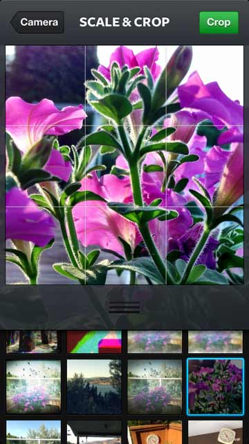
In Instagram your crop screen looks like this.
In the part with the grid, you can use the iphone gestures to enlarge your image and drag it into the best position, so you can enlarge your imported image and move it around to choose the crop.
If you’re using Lightroom or Photoshop you can use the Crop tool to easily crop your images to get the exact creative look you want.
So, go square or go home! Don’t forget to follow my high mountain helicopter adventures on Instagram, starting September 6, 2013 click here.
RELATED ITEMS
Crime Scene Photography, Second Edition The Art of iPhone Photography: Creating Great Photos and Art on Your iPhone


 Ghost towns and the iphone