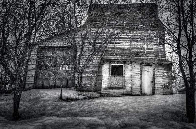
I took a road trip a few weeks ago after a meeting with a client, and found this strange old house in a most unlikely place, tucked in amongst very upscale new homes along a prestigious river drive.
I love the look of this place – it was just so odd! Trouble was I couldn’t get onto the property, the snow was deep and wet, and the crunchy spring snow whose crystals are large and hard and sharp and walking through 2 feet of that with my “work” shoes would be more than one disaster!
So I shot from the road, transfixed by the shapes, textures and mostly the colours! Soft pastel shades of green , contrasted with the weatherbeaten grey tones of the rest of the structure- I thought it would make an amazing colour study. WRONG!
I shot a bracketed set of 5 images – the dreaded white sky was going to cause me problems, so I was thinking about HDR as a solution. I used Photomatix to tonemap the brackets and then in Photoshop I adjusted the colours somewhat but found the entire image to lack a central focus, and there were actually too many competing elements. Grrrr!
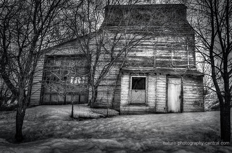
When in doubt take it out!!! ( Rule #1 in composition) So my choice was to simplify the image by removing the color. It was getting there….I uses the fantastically wonderful Nik Silver Efex to transform the B&W into a nice gritty high contrast image. So much for my colour study!
 But now back to that central focus issue – just what was the story I wanted to tell with this image? Looking again at the original “as shot image” I could see that the composition was less than ideal – there were no leading lines directing the viewer to that central spot – which I was realizing was the small door and window – the story is “what the heck is in there!?” “what is the purpose of such as oddball building?” “And how oddball does it look inside?” So to accomplish this storyline, I needed to walk the viewer into the image and right up to the front door! I had to flip the image horizontally to achieve this visual “walk, as in western society our eyes look from left to right.”
And cropping the extraneous trees brought it all in much tighter and with more tension. Some creative dodging & burning lit a path of light that leads to the door, and making the door area the brightest part of the image, clearly makes it the central focus. Working more on B & D for the snow texture to emphasize the “rotteneness” of the snow; and the weathered texture of the old wood created more of a study in patterns and textures rather than my original plan for a colour study. But that’s the way it goes!
Finally, burning in the vignette further emphasizes the door area, almost daring you to “come in”, and adds a bit of mystery to the scene.
What do you think? Was Black and white the right choice? What would you have done to this image to improve it and to tell a story?


 Topaz Clarity Plugin – A new post processing plug-in from Topaz